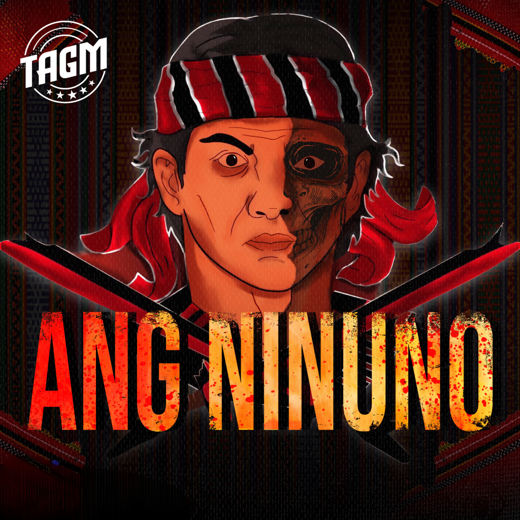
Improved TAGM Logo
The upgraded logo is more than just a visual enhancement—it’s a symbol of growth and adaptability in an ever-changing market. It effortlessly communicates our dedication to creating bold and unforgettable solutions for our clients. Designed to captivate, it leaves a lasting impression wherever it appears, amplifying the TAGM name in every space it inhabits. Whether viewed on a business card or across a digital campaign, the logo embodies our commitment to stellar results and uncompromising standards. Its simplicity amplifies its impact, while the stars add a touch of prestige and ambition, reminding us of the heights we strive to reach.

Minimalist Approach
Our innovative solutions are designed to address the unique needs of our clients and drive success.


Sharper and Sleeker
Upgraded the logo to a higher resolution for a crisp, professional appearance that looks fantastic everywhere—big or small!

Introduced Five Stars beneath TAGM
Introduced five stars beneath “TAGM” to represent the top-notch quality of our work and the stellar team behind it.
Modern Simplicity
Embracing a minimalist design gives our logo a sleek, contemporary look. It’s all about “less is more”—streamlining the design to focus on what truly represents us

Professional & Premium Vibes
A minimalist aesthetic exudes professionalism and a premium feel. It tells the world we’re sophisticated, confident, and committed to quality.
Versatile Across Platforms
Simplicity ensures our logo looks great everywhere—from giant banners to tiny podcast thumbnails. No clutter means clear recognition at any size!


Timeless Appeal
Trends come and go, but minimalism stays classy. A clean design keeps our brand looking fresh and relevant, no matter the decade.